Visualizing a Changing Region
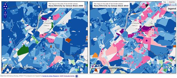
Posted: February 2, 2012 Filed under: Web Map Examples | Tags: bing maps, census, cuny, demographics, interface, openlayers 1 Comment »Visualizing a Changing Region, Block by Block is an impressive web map that displays changes in race and ethnicity between the 2000 and the 2010 Censuses. Created by the Center for Urban Research out of the Graduate Center of the City University of New York, the application allows you too zoom into the neighborhood level and explore the demographic change over the past ten years. Steven Romalewski, director of the CUNY Mapping Service, has written up some blog posts about the application that are worth reading.
The application has three modes of display: a full-width map that uses a vertical slider bar to split the map into 2000 at left and 2010 at right. The ability to wipe back and forth between the two sets of data is very impressive. You can also view two maps of the same extent side-by-side. Moving the cursor over the left map will draw a cursor depicting the same location on the right-hand map and vice versa. The third presentation is again a full-width map, but allows you to alter the transparency on the two layers simultaneously.
Overall, this application is a great source of inspiration when planning your own web mapping application. The Census data is incredibly rich and the Center for Urban Research staff have been able to turn that wealth of data into a map that is accessible to anyone. What’s under the hood is also impressive; the map uses OpenLayers, Bing Maps tiles as the base, PNG tiles rendered by ArcGIS Server (which are being pulled directly from an exploded cache for performance sake), and custom JQuery plugins for the vertical bar slider effect are brought together to create this interactive map.
I have only one minor issue with this overall excellent map. I think the transparency slider map is perhaps the most fun to use, swiping back and forth between 2000 and 2010 data, however I wish the interface used a toggle button to initiate the smooth transparency transition between the two and not a slider. A slider can be left somewhere in the middle, which produces a map with misleading colors and data. Always strive to control the interface so that misleading maps cannot be produced by your application, yet still provide the user enough flexibility to explore the data you provide. Nonetheless, this is a great example of a web mapping application that makes data clearer and more accessible.
Leaflet
Posted: January 31, 2012 Filed under: Application Programming Interfaces | Tags: apis, arc2earth, cloudmade, javascript, openlayers, openstreetmap, vector Comments Off on LeafletLeaflet is a JavaScript-based API for web mapping that is designed to support both desktop and mobile platforms. Developed by CloudMade, a big supporter of OpenStreetMap, Leaflet looks to be an awesome library for you to construct your maps.
Leaflet allows you to do the basics, of course, such as popup an information window and overlay your own data. It can do far more than that and is a viable replacement for Google Maps. The functionality brought by Jason Sanford’s Leaflet Vector Layers is a real selling point for me. Geocommons are ArcGIS Online are two easy ways for people to get their data on the web. Leaflet Vector Layers then makes pulling that data into a web map simple. The Vector Layers plugin also makes Arc2Earth data available to you. Arc2Earth is a great tool for helping you move your data off of the desktop on to a cloud-based service. They have been doing some amazing work with storing geospatial data in Google Fusion Tables. However you share your data on the web, Leaflet can bring it in to a web map and display it. If it’s easy to code and produces something that is easy to use and aesthetically pleasing, it’s going to be a big success.
I am working on a project at Rowan where we are looking to make an interactive campus map that will zoom down to the room level, displaying floor plans of the buildings on campus. The flexibility and the cross-platform functionality of Leaflet means that I will seriously consider using this Library to power the user interface of the map. I was originally thinking about OpenLayers, but Leaflet seems powerful enough to do all that I require.
Hat tip to Andrew Turner for the pointer to Leaflet Vector Layers.
Dymaxion Web Mapping
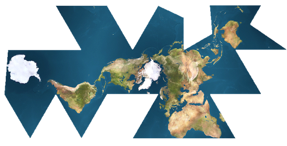
Posted: January 25, 2012 Filed under: Application Programming Interfaces, Web Map Examples | Tags: dymaxion, flash, javascript, openlayers, projections Comments Off on Dymaxion Web MappingR. Buckminster Fuller was truly a modern Renaissance Man. Bucky created many inventions and championed several ideas that have shaped the way we live. One of his creations is the Dymaxion map projection. The map projection is rather complex; the developable surface is an icosahedron. When the icosahedron is then sliced and flattened, it produces a world map that is visually intriguing. It is truly unlike any other map projection.
Though difficult to produce, the code for producing such a projection in a web map is available. Using the OpenLayers JavaScript API and some custom JavaScript from Protovis, Zachary Johnson was able to put together this demo of the Fuller/Dymaxion Projection as the projection for a web map.
In Zachary’s post, he also mentions the Faumaxion web map, which is a Flash-based web map that reorients itself so that north is at the top for any of the triangular faces of the Dymaxion projection. Michal Migurski, a partner at Stamen Design, has the details on how he created the Dymaxion slippy map.
The downside to using a Dymaxion projection in your web map is that the support for the projection amongst the mapping APIs is minimal. You will need to do more of the heavy lifting in order to get this projection working properly in your web map. That’s also ignoring the fact that many people are not spatially aware and that this different projection will require your audience to orient themselves with the way the Earth has been projected. While Spherical Mercator is common and familiar, it does grossly exaggerate the areas closer to the poles, which in turn distorts your mapped data. Choropleth maps depicting a variable dependent on area, such as population density, are often misleading when mapped with a Mercator projection. The Dymaxion map is closer to an equal-area map than most, however the variable orientation towards North makes this projection a hard sell to a general audience.
Nonetheless, the Dymaxion map is an incredible map projection, from both a scientific and aesthetic point of view. The time spent by some very dedicated, intelligent people to get this working in interactive form speaks to the admiration of the projection and its creator. If only Bucky had lived long enough to see what wonders the Internet hath brought…


Recent Comments