Visualizing a Changing Region
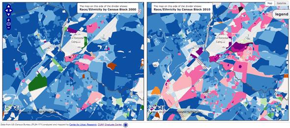
Posted: February 2, 2012 Filed under: Web Map Examples | Tags: bing maps, census, cuny, demographics, interface, openlayers 1 Comment »Visualizing a Changing Region, Block by Block is an impressive web map that displays changes in race and ethnicity between the 2000 and the 2010 Censuses. Created by the Center for Urban Research out of the Graduate Center of the City University of New York, the application allows you too zoom into the neighborhood level and explore the demographic change over the past ten years. Steven Romalewski, director of the CUNY Mapping Service, has written up some blog posts about the application that are worth reading.
The application has three modes of display: a full-width map that uses a vertical slider bar to split the map into 2000 at left and 2010 at right. The ability to wipe back and forth between the two sets of data is very impressive. You can also view two maps of the same extent side-by-side. Moving the cursor over the left map will draw a cursor depicting the same location on the right-hand map and vice versa. The third presentation is again a full-width map, but allows you to alter the transparency on the two layers simultaneously.
Overall, this application is a great source of inspiration when planning your own web mapping application. The Census data is incredibly rich and the Center for Urban Research staff have been able to turn that wealth of data into a map that is accessible to anyone. What’s under the hood is also impressive; the map uses OpenLayers, Bing Maps tiles as the base, PNG tiles rendered by ArcGIS Server (which are being pulled directly from an exploded cache for performance sake), and custom JQuery plugins for the vertical bar slider effect are brought together to create this interactive map.
I have only one minor issue with this overall excellent map. I think the transparency slider map is perhaps the most fun to use, swiping back and forth between 2000 and 2010 data, however I wish the interface used a toggle button to initiate the smooth transparency transition between the two and not a slider. A slider can be left somewhere in the middle, which produces a map with misleading colors and data. Always strive to control the interface so that misleading maps cannot be produced by your application, yet still provide the user enough flexibility to explore the data you provide. Nonetheless, this is a great example of a web mapping application that makes data clearer and more accessible.


Recent Comments