Web Mapping @ Rowan Summer 2014
Posted: April 19, 2014 Filed under: Course Updates Comments Off on Web Mapping @ Rowan Summer 2014Rowan University’s Web Mapping & GIS Services course is offered again this summer! The eight-week course will run from July 1st to August 25th.
The course has been updated to reflect the latest developments in the web mapping field. Students will receive a stipend to work with Amazon Web Services and will have access to web servers to create applications using ArcGIS Server 10.2 and Geoserver 2.5.
For more information on how to register, visit Rowan’s Online Registration Page.
Share this article with your friends.
Quick update on student’s AWS usage
Posted: August 20, 2012 Filed under: Course Updates Comments Off on Quick update on student’s AWS usageI just sent this note out to my students:
I just wanted to share with you some numbers on the entire course’s AWS usage. These numbers are for all accounts, including my account used for hosting some of the services, such as the WMS and tile cache in Week 7.
3.2TB of storage has been provisioned in EBS drives. Cost: $322.63.
9,713 hours of EC2 instances have been running. Cost: $314.06.
76,308 tiles have been served up from CloudFront. Cost: $1.88 (approximately), which includes transfer, storage, and serving.
Total bill for August, so far: $658, which includes other minor charges.The storage cost is also very high because each of you have copied the AMIs on my account, so you could arguably divide that by 16 or more and get a number closer to what you would see if you implemented a GIS server on your own from a publicly shared AMI.
If you can generate your map tiles locally – or even on EC2, but then shut down your instance – you can host some awesome web maps for very little money. And if you want a live server running, too, it won’t break the bank.
So far, I’ve been receiving positive feedback on using a cloud computing platform for teaching server-side GIS. Except for a few hiccups related to security settings, remote desktop, and an issue with EBS drives not mounting, it’s been a good experience for everyone – myself definitely included.
Tomorrow is the start of Week 8, where the students will be presenting their final projects – a web mapping application of their own design. I will post links (and screenshots, for posterity) of the projects as they’re submitted.
Thanks again to Amazon Web Services for the Education Grant supporting this course.
Recommend this article.
Getting started with programming: CodeAcademy
Posted: March 28, 2012 Filed under: Introductory Topics, Learning Resources | Tags: javascript, programming, resources Comments Off on Getting started with programming: CodeAcademyThe interactivity and aesthetics of the modern Web would not be possible without JavaScript. The web runs on JavaScript. JavaScript is also one of the best languages to develop your custom web maps; it’s cross-platform, there’s no cost of entry, and it’s easy to learn.
If you have little to no programming experience, check out CodeAcademy. This site will walk you through basic programming concepts and build your knowledge towards being able to construct awesome JavaScript-driven web sites. If you create a free account on CodeAcademy, it will keep track of your progress; this is recommended as CodeAcademy has plenty to offer.
Share this article with your friends.
GeoServer on AWS
Posted: March 27, 2012 Filed under: Course Updates | Tags: AWS, Course, GeoServer Comments Off on GeoServer on AWSIn planning my 8 week course, I realized early on that I wanted to devote a portion of the class to cloud computing. If you’re not familiar with cloud computing, it is the ability to tap into computing resources on an as-needed basis. It’s a fairly old idea that unfortunately has been elevated to buzzword status when discussing modern computer systems. Cloud computing is worth your excitement as anyone – large organizations down to single users – can tap into cloud-based resources. Amazon Web Services, perhaps the largest, definitely the most well-known cloud computing provider, allows you to run servers on their infrastructure for only pennies per hour.
Why does this matter to you? As a GIS person, you may think that dealing with servers and creating websites are the stuff of the IT department. The trend in GIS is moving away from static maps and paper media to rich, interactive experiences provided by web-based map services. To provide the best experience – in terms of interactivity, efficiency, and aesthetics or branding – to your users, you will likely need your own GIS server. In the past, purchasing a server would take months of negotiation with IT, Purchasing, and other levels of bureaucracy within your organization. If you wanted a GIS server for a personal project, unless you are incredibly wealthy, the capital investment alone would have made your project infeasible. With cloud computing, you can get started with just a credit card, starting small and scaling your resources as needed.
I have been developing an AMI for use in the class that will have you up and running with a GIS server in a matter of minutes. This server will be configured with some common open source software that you will be able to use to host your own web maps and GIS services on Amazon’s infrastructure. GeoServer is an open source GIS server that will allow you to share your GIS data via web maps, map tiles and through KML. While this machine image does not have ArcGIS installed, there are some open desktop GIS options available. I’ve gone the open source route so that upon completion of my course, you can keep your web/GIS server running without licensing or maintenance costs. You would just need to pay Amazon for the time the server is active. For those of you that are a 100% ESRI shop, don’t worry, I will have an AMI with ArcGIS Server 10 available for some assignments. Once I have fully tested the AMI, I’ll gladly share the AMI id here.
If you’re interested in getting hands-on exposure with web maps, GIS servers and cloud computing environments, enroll in my course. Feel free to ask me any questions beforehand via Twitter or email.
Share!
Base Map Sex Appeal
Posted: March 22, 2012 Filed under: Application Programming Interfaces, Web Map Examples | Tags: base maps, map tiles Comments Off on Base Map Sex AppealSo many web maps are based on Google Maps, using their basic map tiles. It’s easy to become numb to seeing the same red inverted teardrop markers on the same light, warm colored map tiles. If you’re already working with Google Maps (version 3, of course) you can spice up those base maps with custom rendering rules.
Through the StyledMapType, you can modify Google’s base map tiles to feature different colors and shades for the features represented on the map. There is even a nifty Styled Maps Wizard that can help you create the code that defines the styling rules.
If you’ve moved on to more open platforms and are considering using another base map provider, check out the new base maps produced by Stamen. I really like all three styles and while they are essentially your background, they can add an entirely different feel to your web map. They include instructions on incorporating those tiles into ModestMaps, Leaflet, OpenLayers and Google Maps.
Share!
Easy way to share some data using Google Maps
Posted: February 6, 2012 Filed under: Tips and Tricks | Tags: arc2earth, ArcGIS, Dropbox, Google Earth, Google Maps, kml Comments Off on Easy way to share some data using Google MapsLet’s face it, nowadays everyone uses Google Maps. You can capitalize on the public’s familiarity with Google Maps by using GMaps as the interface for your own GIS data. You may or may not be familiar with Keyhole Markup Language, aka KML, which is the format of Google Earth. KML is relatively easy to author – it’s an XML-based format – using Google Earth, Arc2Earth, or ArcGIS’s Export to KML tool. But did you know that once you have that KML file, you can put it on the web and pass its URL to Google Maps to have the KML rendered?
Try it out with Google’s own sample KML file. This sample file has many example features and is a great way of demonstrating Google Maps’ KML parsing abilities.
Google’s Sample KML: http://code.google.com/apis/kml/documentation/KML_Samples.kml
Paste this link into the search box on Google Maps to see the data.
If you’re familiar with how a query string works, you can direct your users to Google Maps and have your data appear once the page loads.
http://maps.google.com/maps?q=http://code.google.com/apis/kml/documentation/KML_Samples.kml
The blue portion of the link above signifies the path. The Question Mark in red marks the end of the path and the beginning of the query string in green. The query string is composed of one key-value pair; the variable q (for “query”) is set to our URL. Try it out! You could easily put a link to your own KML after the “?q=” in the URL, provided you have some place to host the KML.
If you don’t have your own web hosting, you can always use Dropbox and store your KML in the “Public” folder. Files stored in the Public folder receive their own URL which you can share on the web. I’ve stored a KML file created for an event that was on Rowan’s Campus in 2010 in my Public folder. You can view that KML file on Google Maps using this URL.
Google Maps can handle most KML files, so consider this the next time you quickly want to share some GIS data with some non-GIS users. You could easily go from ArcGIS Desktop to Google Maps in five minutes; save the KML in your Dropbox folder, write the URL and you’re done.
Share this article with your friends.
Visualizing a Changing Region
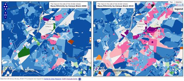
Posted: February 2, 2012 Filed under: Web Map Examples | Tags: bing maps, census, cuny, demographics, interface, openlayers 1 Comment »Visualizing a Changing Region, Block by Block is an impressive web map that displays changes in race and ethnicity between the 2000 and the 2010 Censuses. Created by the Center for Urban Research out of the Graduate Center of the City University of New York, the application allows you too zoom into the neighborhood level and explore the demographic change over the past ten years. Steven Romalewski, director of the CUNY Mapping Service, has written up some blog posts about the application that are worth reading.
The application has three modes of display: a full-width map that uses a vertical slider bar to split the map into 2000 at left and 2010 at right. The ability to wipe back and forth between the two sets of data is very impressive. You can also view two maps of the same extent side-by-side. Moving the cursor over the left map will draw a cursor depicting the same location on the right-hand map and vice versa. The third presentation is again a full-width map, but allows you to alter the transparency on the two layers simultaneously.
Overall, this application is a great source of inspiration when planning your own web mapping application. The Census data is incredibly rich and the Center for Urban Research staff have been able to turn that wealth of data into a map that is accessible to anyone. What’s under the hood is also impressive; the map uses OpenLayers, Bing Maps tiles as the base, PNG tiles rendered by ArcGIS Server (which are being pulled directly from an exploded cache for performance sake), and custom JQuery plugins for the vertical bar slider effect are brought together to create this interactive map.
I have only one minor issue with this overall excellent map. I think the transparency slider map is perhaps the most fun to use, swiping back and forth between 2000 and 2010 data, however I wish the interface used a toggle button to initiate the smooth transparency transition between the two and not a slider. A slider can be left somewhere in the middle, which produces a map with misleading colors and data. Always strive to control the interface so that misleading maps cannot be produced by your application, yet still provide the user enough flexibility to explore the data you provide. Nonetheless, this is a great example of a web mapping application that makes data clearer and more accessible.
Recommend this article.
Leaflet
Posted: January 31, 2012 Filed under: Application Programming Interfaces | Tags: apis, arc2earth, cloudmade, javascript, openlayers, openstreetmap, vector Comments Off on LeafletLeaflet is a JavaScript-based API for web mapping that is designed to support both desktop and mobile platforms. Developed by CloudMade, a big supporter of OpenStreetMap, Leaflet looks to be an awesome library for you to construct your maps.
Leaflet allows you to do the basics, of course, such as popup an information window and overlay your own data. It can do far more than that and is a viable replacement for Google Maps. The functionality brought by Jason Sanford’s Leaflet Vector Layers is a real selling point for me. Geocommons are ArcGIS Online are two easy ways for people to get their data on the web. Leaflet Vector Layers then makes pulling that data into a web map simple. The Vector Layers plugin also makes Arc2Earth data available to you. Arc2Earth is a great tool for helping you move your data off of the desktop on to a cloud-based service. They have been doing some amazing work with storing geospatial data in Google Fusion Tables. However you share your data on the web, Leaflet can bring it in to a web map and display it. If it’s easy to code and produces something that is easy to use and aesthetically pleasing, it’s going to be a big success.
I am working on a project at Rowan where we are looking to make an interactive campus map that will zoom down to the room level, displaying floor plans of the buildings on campus. The flexibility and the cross-platform functionality of Leaflet means that I will seriously consider using this Library to power the user interface of the map. I was originally thinking about OpenLayers, but Leaflet seems powerful enough to do all that I require.
Hat tip to Andrew Turner for the pointer to Leaflet Vector Layers.
Share this article with your friends.
Long Live Mapquest!
Posted: January 30, 2012 Filed under: Application Programming Interfaces | Tags: apis, mapquest, mapstraction, openstreetmap Comments Off on Long Live Mapquest!Mapquest, the granddaddy of web mapping platforms, has been losing market share ever since Google Maps burst on to the scene. Google Maps’ tile-based (aka “slippy”) map interface and API caused many to adopt Google’s offering over Mapquest for integration with web sites as well as for daily use.
Mapquest has since turned over a new leaf and is offering a tiled map based off of OpenStreetMap data. Announced in 2010, the OSM-sourced map is just one of a few developer-friendly moves the company has recently made.
If you want to get started using Mapquest maps in your blog or personal web page, they have a simple to understand page on how construct your map using their Map Builder application. You can then embed maps into your WordPress blog using their plugin. If you want something more advanced, you can use their Open APIs to incorporate their OSM tiles and data into your application.
And if you don’t want to use Mapquest’s API as the framework for building your application, you can always use the Mapstraction library and still use the tiles and some of their other data services.
Share this article with your friends.
Map Example: NJ Land Change Viewer
Posted: January 27, 2012 Filed under: Web Map Examples | Tags: animated, example, land change, land change viewer, new jersey Comments Off on Map Example: NJ Land Change ViewerEach week, I would like to feature a web mapping project/application that goes beyond the simple points-on-a-map example. If you know of a web mapping project that should be featured on the site, please email me at examples [at] learnwebmapping.com. Don’t be bashful; if you have or are in the process of developing an innovative web mapping project or application, please send me a link and some details on the project. Share with us your inspiring application and the backstory of its development.
To get things started, I would like to share with you a series of blog posts from my new jersey geographer blog that detail the time spent brainstorming and developing the New Jersey Land Change Viewer. The NJ LCV is an interactive web mapping application that employs animation of the map layers to depict changes to New Jersey’s landscape over a twenty-one year period. I was the sole developer of the project; if it was not for open source software and cloud-based hosting services, I wouldn’t have been able to make the application a reality.
After the project was released, I wrote the following about the experience:
Again, if you are working on a web mapping project or know of a recently released project that should be featured here in depth, please drop me a line at examples at learnwebmapping.com or @reply me on Twitter.


Recent Comments